Labels

Thursday 15 December 2011

PLANNING - DVD / Magazine drafts for ancillary tasks


This is my first Dvd draft, i like this one because i think the smily faces make it effective.


This is my second dvd draft, i like this one because of the cloud shape which my picture will be inside.


 This is my first magazine draft i like this one because it's busy and i like the smiley faces which relate with the first dvd cover i created.


This is my second magazine draft, this one seems a little boring compared to the other one, in which case i prefer the first one.

I have also prepared two drafts showing the colours I am planning to use, these are red, yellow and blue. The first one is my DVD draft.


Then i produced a draft for my Magazine, which is aimed at young children.

Friday 9 December 2011

PLANNING - Ancillary tasks - possible fonts, colour charts and picture planning.

These are a few possible fonts i can use for my DVD cover and my magazine. I think they are all simple and easy to read which is what you need for a younger target audience. My favourite font is Trebuchet MS as its bold and simple to read.


Below are some colour schemes i could use for my DVD case and Magazine. They are all bright fun and young. My favourite one is the red, blue and yellow one.


Picture planning.
We plan to take pictures for our ancilliary tasks straight after we have finished filming as we will already be in the correct costumes and have all the props etc. This will make it easier and more effective.


PLANNING - Script


All characters are shown in the first shot - boys are shown biking together on one bike, showing that they are getting up to mischief. The girls come in walking, giggling because they fancy the boys. The shot is then froze, and the title "RunAround" appears above them, letter by letter. This is shown as being very bright and colourful to emphasise fun and youth. This shot is taken outside on the playground.

The camera then changes to a sequence showing each individual character.

Emily: 
Emily is dressed in fashionable clothing and sat at a school desk in a classroom. In the shot Emily is shown as going into her handbag and getting out her compact mirror. The shot then freezes with Emily applying her lipstick using her compact mirror. Her name then appears above in pink writing to symbolise her femininity.

Jack:
Jack is dressed in smart clothing and is also sitting in a classroom at a desk. Jack's desk is surrounded by books representing his willingness to learn. The next shot then shows Jack reading an equation from his text book. The shot then freezes, and his name appears above in green writing, showing he's quite an average character.

Sarah:
Sarah appears on screen and is seen playing with a football on the school field. She is dressed in sporty clothes, e.g a hoodie. The shot then freezes showing Sarah catching the football. Her name then appears above in the colour blue. Blue was chosen as it's stereotypically a male colour and it represents her Tom-boyish ways.

Tom:
Tom is shown messing around trying to fit into a locker down the corridor, this is representative of his funny, naughty character. The next shot then shows him laughing, which then freezes and his name appears above in red writing. We chose red writing for Tom as it's a fun bright colour which represents his character.

The camera then changes and shows Sarah and Emily getting excited because Emily has received a text from Tom, they are giggly to represent the fact they are young and immature. This shot is shown walking down the corridor. The shot then freezes showing what was in the text message Emily received from Tom. The last shot then shows them bumping into each other down the corridor, The shot then freezes and Tom is shown to be messing around behind Jacks back to show his funny character. The shot then freezes and fades out. Lastly, "RunAround" appears on screen letter by letter, each bright and colourful.

PLANNING - Storyboard

This is our storyboard for our shots.


PLANNING - Shot List

PLANNING - Characters

Sarah played by Dani Richardson:
Sarah is a sporty, carefree character who isn't too bothered about her appearance and focuses mostly on sport. Sarah is represented as being tom-boyish and being clever.

Emily played by Phoebe Nickalls
Emily is very much a girly girl, who cares deeply about her appearance. She has long blonde hair and always dresses fashionably and Represented as giggly and flirty.

Tom played by Joe Davis
Tom is athletic and friendly. He is shown as being the trouble maker of the group and trying to influence Jack to do things with him.

Jack played by Jack Hurst
Jack is represented as the clever, geeky character. He does not like to get into trouble and trys to stop Tom being a bad influence on him. He always dresses smartly.

Below is an image of our characters in their costumes.

PLANNING - Production Plan

Who:
Charlotte Randall, Mollie Hinson & Emma Shepherd - Production team.
Joe Davis - Tom
Jack Hurst - Jack
Dani Richardson - Sarah
Phoebe Nickalls - Emily

Dates:
January 7th
January 21st
February 3rd
February 10th

Equipment:
Tripod
Camera
Camera charger

Costumes:
Joe Davis (Tom) - Wearing casual jeans and a jacket, with trainers.
Jack Hurst (Jack) - Wearing jeans, and a checked shirt. Also wearing glasses, looking smart.
Dani Richardson (Sarah) - Hoodie, tracksuit bottoms and trainers. Tom-boyish.
Phoebe Nickalls (Emily) - Black jeans and a white jumper. Also wearing Dolly shoes, carrying a handbag and wearing jewrelly.

Locations and why you have chosen them:


Risk assesment:


Playground:


  • Risks - Falling off of the bike onto the concrete. 
  • Precautions - Make sure the person riding the bike is confident and capable, wear helmets, knee and elbow pads (under clothing)
Classroom:


  • Risks - Tripping over chairs / wires / bags etc.
  • Precautions - Make sure all chairs are tucked in, make sure wires are clamped to walls etc and bags are safely out of the way.
School Field:


  • Risks - Slipping over on wet grass, and injuring herself with the ball.
  • Precautions - Make sure we film on a dry day and ensure the actor is confident with the skills they need to demonstrate. Do not mess around with the props.
Corridor:


  • Risks - Bumping into other students and getting stuck in the locker.
  • Precaution - Film during lesson time to ensure there are no students wandering around the school. Make sure that the locker is big enough and safe enough for the actor to get in and out of. Do not mess around with the props.


    Props:
    Bike
    Helmet
    Elbow and knee pads
    Compact mirror
    Handbag
    Lipstick
    Text books
    Glasses
    Ball
    Locker
    Mobile phone

    Tuesday 6 December 2011

    RESEARCH - Focus Group

    From analyzing my questionnaire results i found out that the majority of people that completed it were up to the ages of five, although i am going to make this a little older because i feel they are too young to realize what they like and dislike about things, so I've decided to use the age range of 4 to 9. I used six children in this age range, 3 boys and 3 girls to make it fair.I showed them all the three opening sequences I had previously analysed, these were: Lizzie McGuire, Balamory and Ben 10.  I then asked them what they liked and disliked about these opening sequences.

    Lizzie McGuire

    • Only 16.% noticed the directors and producers names which were show at the beginning of the sequence. 
    • 66.%  said they like the plain white background as it made the characters stand out, although 40%  thought that it was boring. 
    • 84% said they like the fact the characters names appeared at the side of them, clearly showing who was who helping you follow it if your new to the programme. 
    • 80% said that they like the "big ball" prob because it showed the excitement and closeness of the family. 
    Balamory
    • 80% said that they liked the music created just for Balamory as it is fun and explanatory.
    • 20% thought the song was too repetitive. 
    • 36% said they liked the use of CGI and bright colouring used in the opening sequence.
    • 50% said that they liked the way you followed the characters showing what they do and getting an idea of their personality.  
    • 64% said they didn't like the idea of CGI as it was too childish. 
    Ben 10
    • 80% of people said they like the idea of having a prop like "Bens watch" will can allow them too change into another character instantly. 
    • 50% said they like the idea of the aliens being shown which Ben can turn into. 
    • 50% disliked this because they thought it gave away too much of the progamme.
    • 36% said they like the space effect at the beginning.
    • 100% though a minute was just the right length for an opening sequence. 
    After finding out these results, i told my focus group of the idea i have for my opening sequence. I asked them too come up with at least two things they liked and disliked about my ideas. The majority of peoples answers were..

    What they like most. 
    The things that i mentioned that appealed to them most were...
    • Having an opening sequence that was between 40 seconds and a minute long.
    • Introducing all main characters one by one, ensuring you know their personalities.
    • They liked the idea of a upbeat, young track.
    What they disliked..
    The things that they disliked most were..
    • Having computer generated characters - they said this was childish. 
    • The colour scheme of red blue and green, they said they only like the idea of blue and red. 
    I will take this research into consideration when creating my opening sequence.

    RESEARCH - Audience Research Analysis - Dvd and Magazine.

    I also created a questionnaire to find out what people preferred on their DVD and Magazine covers. I found out that the majority of people did not want the directors/producers names on the front of the DVD cover. I also found out that most people completing my questionnaire wanted three main characters on the front of the DVD/Magazine covers and the most popular colours people wanted were blue and red. This will be suitable because they both can be used as unisex colours so i can appeal to a larger audience. Furthermore i found out that people want the same colours used on the DVD cover to be used in the Magazine. Also, the most popular things people wanted included in the magazine were Character fact files, quizzes and stories. Lastly i found out that people completing my questionnaire want the same characters to be on the DVD and Magazine covers.


    These print screens show that the majority of people do not want the producers or directors names on the front covers, also that people want three characters on the front covers and want them to all be main characters. 


    This shows that most people prefer the colours of blue and red, this will be suitable because these can be used as unisex colours. 


    These print screens show that the majority of people want the same colours used for both the DVD and Magazine covers. Also the preferred things to be included in the magazine are quizzes, stories and Character fact files. 

    Lastly, i found out that most people want the same characters to be used in both the DVD and Magazine. 

    Friday 2 December 2011

    RESEARCH - Audience Research Analysis - Main tasks

    After Analysing the results from both my audience questionnaires i have found out that the majority of people who completed it were up to the ages of 5, therefore my target audience is of this age. Although i will take this on board, I will also aim my target audience slightly higher as i want it to appeal to children up to the ages of 10. My research also tells me that my viewers are mostly females, but in my opening scene i am going to include males also because it needs to appeal to both audiences. The most popular Children's Tv programmes that were watched by the people completing my questionnaire were Balamory and Lizzie McGuire. Balamory was picked as the favourite because of the friendly characters and the use of CGI which i thought would appeal to my target audience of that age. From asking how long the opening sequences should be the most popular were less than 30 seconds and both 30 seconds to a minuite. I think between 30 seconds to a minuite is about right to introduce all the main characters and set the scence. Also i have found out that my audience want to have some of the main characters in the opening sequence, which i will take on board when creating my opening sequence. Furthermore i have found out that my audience prefer to have a song made for the programme, like the one in Balamory which is created to tell you what's going on in the opening sequence. I will take this on board although it may be a bit difficult. An equal amount of people want to see real life characters as well as computer generated ones. Lastly i found out that the majority of people want both sexes to be in the opening sequence. Below are some print screens of my findings.


    These are my first two questions showing that the majority of people are up to the ages of five and mostly female.


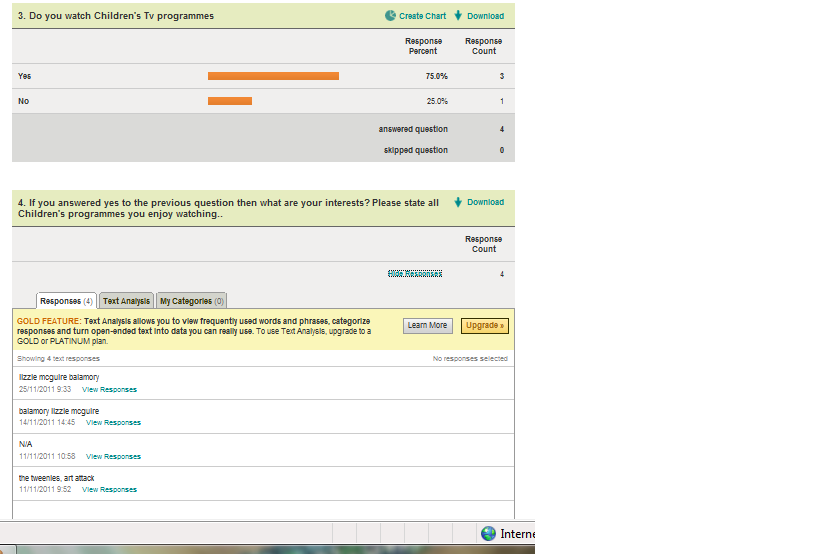
    As you can see from the above questions the most popular Tv programmes mentioned were Balamory and Lizzie McGuire.


    The reasons why Balamory was most like was because of the friendly characters and the use of pictures and colours. From analysing Balamory, i know the attractive pictures in Balamory were created using CGI.


    From the above questions you can see that there were equal amounts of people who wanted the opening sequence to be less than 30 seconds and between 30 seconds to a minuite. Also that the majority of people want just a few of the main characters in the opening sequence.

     The last questions asked show that the majority of people would prefer a song created for the opening scene and the both the same amount of peope want real life and cartoon characters. Lastly, the majority of people want both males and females in the opening sequence.