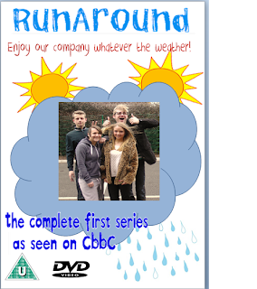
Labels

Monday, 16 April 2012

EVALUATION - How effective is the combination of your main product and ancillary tasks?


As you can see in all my products I have used the logo successfully in tying all the products together and creating strong brand identity.

Tuesday, 10 April 2012

EVALUATION - In what ways does your media product use, challenge or develop forms and conventions of a real media product?

Media conventions
View more PowerPoint from charlotterandall

Here is my commentary on conventions for my audiovisual media.


During the research part of my coursework I analysed products and discovered conventions of existing similar DVD covers, magazine covers and opening sequences. My reasons for doing this is so my pieces were more realistic and more likely to appeal to the target audience. Here are the links to my products:

Ben 10 opening sequence
Lizzie McGuire opening sequence
Balamory opening sequence

Hannah Montana DVD cover
Ben 10 DVD cover
Balamory DVD cover

Hannah Montana magazine
Ben 10 magazine
Balamory magazine

Thursday, 29 March 2012

EVALUATION - What have you learned from your audience feedback?


I used social neworking sities such as Facebook to share my work as a way to gain audience feedback. This is an  effective way to collect information as people are free to comment on my work and are open to their own veiw, as there is no closed questions. I asked people to comment on my work, telling me what was good, bad and what could be improved. Below is the feedback i recieved.

                                                               Back of DVD cover


Front of DVD cover


Magazine cover


The feedback i have received on the back of my DVD cover was as follows;

-Maybe add the characters names underneath to make it that little more effective

 -The DVD write up makes the DVD sound fun to watch. Brand identity has been used here.

The feedback i have received on the front of my DVD cover was as follows;

- Hey, I don't really talk to you, but I had this issue with my coursework, the photos rather entertaining, but it doesn't really say what the DVD is about, some kind of running for sport? Other than that its quite good, maybe add like a subtitle/ catch phrase to imply what it is. Hope Ive helped :)

- nice use of colours and good picture, just the DVD picture thing is slightly cut off on the right

- I agree with above comments, maybe add in a catch phrase to give an idea what the DVD is about

- DVD cover looks good and the different & fun colours have been used again (Brand identity)

The feedback i have received on my magazine cover is as follows;
- Very good, clear writing, large image, lots of tag lines, most of space covered, but not too cluttered, good work!
-  It will entice the young children which it is aimed for, its got a good use of different colours which will attract their attention, it also has a free sticker book which is soooo cool. The name of the magazine is on all the 3 pages which represents brand identity. I also like the way you can collect all 4 posters, it will make people buy all the magazines
- Fantastic, this is the best one.

Through posting both on facebook my progress, I found out what people liked and disliked about my product. I found that consumers wanted to see a catch phrase on the DVD cover to give an idea what the programme was about, so i added in , "meet Tom, Jack, Sarah & Emily on their journey through high school." I also found out from my research that on the back of my DVD cover consumers wanted to see names above each picture of the individual character, so i added this feature to ensure my product was the best it could be. Furthermore i found out that my magazine cover was the best one i had produced and i found out that the audience liked that product mostly, so i left it the way it was as i felt it was successful enough. Overall, from the audience feedback i received through Facebook, i was able to change my products in the best possible way, making them more attractive to the target audience. I feel that by doing this i have made the best i could of out of my products.

_____________________________________________________________________________

Below is my survey i produced to receive feedback on my audiovisual media product.


Create your free online surveys with SurveyMonkey, the world's leading questionnaire tool.


Here are my responses;


The first response shows that i had feedback from both males and females, showing a wider range of responses. My second question shows that the audience taking my survey were between the ages of 6-10, meaning that they are in the age range for my particular target audience, so their feedback will be the most important for my product, as they are who I'm aiming it at.

My third question shows that both participants thought that my opening sequence appealed to them.

One of the strengths recognised by my audience was that they liked the way each character was introduced individually, this feedback is effective for me because if i was too make another product i will know whats effective.  


From asking what people thought were the weaknesses of my opening sequence was and how i could improve it; i found that my audience didn't enjoy the music i had chosen for my programme, this was effective for me because it gave me a chance to change it to something more appropriate.

_______________________________________________________________________________


Create your free online surveys with SurveyMonkey, the world's leading questionnaire tool.

I also created a survey to gain feedback for my ancillary tasks, below were the responses i received.


100% thought that i used a variety of fonts excellently and that my images were effective. 


100% of people thought that the colors i used were unisex and attracted a wide audience, this is important as i aimed my product at both males and females. When asking if my layout was suitable, i had positive responses. 


100% thought that most of my language was appropriate for my target audience, and the main things people liked about my magazine was the colors. 

I had mostly positive feedback when asking what people liked and disliked about my DVD cover. Someone suggested that i should add a tag line explaining what the DVD was about, so i did. 

Feedback suggested that i should add more cover lines onto my magazine cover. 

100% thought that having the same title throughout all my products was effective as it was consistent and created brand identity. 


100% of people completing my questionnaire said that they would buy my magazine or DVD cover. 

By completing these surveys i have gained constructive feedback on the products i have produced. I have learnt from my audience what aspects they liked most, what they disliked and what they thought could be improved. Overall, i received positive feedback with a few changes. 


_______________________________________________________________________________

I also used a focus group to gain feedback and help me with my evaluation. I asked two children, Bridie aged 6 and Bobby aged 10 a variety of questions after showing them my video for my opening sequence. The questions i asked my focus group were:

1: What did you like best about the video?
2: What did you dislike about the video?
3: What could i improve on in the video?
4: What did you think about the music in the video?
5: Did you like the variety of colours used?
6: Would they watch my programme? And why?

Bobby's response:

1:  I liked the different characters
2: I didn't like Tom because i was unsure of his character
3: I would change the way Tom was shown
4: Yeah i enjoyed the music, it was cool
5: Yeah, they were really bright!
6: Yeah i would watch it because it looks interesting

Bridie's response:

1: I liked the character Emily because she was a girl and like how i want to be!!
2: I didn't like the character Tom because he didn't look fun
3:  I would make Tom more fun  
4:  I like the music, it was fun
5: Yeah they were bright and fun
6: I would watch it because i like the characters

By having a focus group i was able to gain first hand knowledge on what my target audience liked and disliked about my opening sequence. By having this knowledge i now know what to keep the same and what to improve on if i was going to do it again. I learnt that both respondents liked the use of different characters, but thought Tom's character was unclear. I also learnt that both respondents like the music and colours and thought it was bright, which is what i aimed to do. Both respondents said they would watch my product which is a positive outcome.

_________________________________________________________________________________


Friday, 23 March 2012

PLANNING - Magazine cover drafts


Because of the feedback i recieved, i decided to change my magazine cover completely.


PLANNING - DVD Drafts


Because of the feedback i recieved, i decided to make a new DVD cover and a back cover.


Friday, 16 March 2012

PLANNING - Institutions

There are many intuitions that produce children's TV programmes like the one we aim to produce. The BBC have a subsidiary called CBBC which produce many children's TV programmes with the same age range of ours, (7-11) The British Broadcasting Corporation, (BBC) is a British public service broadcaster headquarter at Broadcasting House in the City of Westminster, London. It has been around since 1927, although stopping for a few years because of the war. The BBC has around 23,000 staff. It's main responsibility is to provide public service broadcasting in the United Kingdom, Channel Islands and the Isle of Man. The BBC's work is funded by annual television licence fee, which is charged to all British households, or anyone using any type of live television broadcasts. Because the BBC is publicly funded, there are rules which govern what they can do, and their programmes are made for the consumers education and entertainment.

One of the programmes made by CBBC which can be an example of what they produce which is similar to our is Bear Behaving Badly, which can be seen through the link below.


Another company which produces similar products like ours is ITV, know as the Independent Television Authority. Launched in 1955, it is the oldest commercial network in the UK. The difference between ITV and BBC is ITV get there funding for programmes through advertising, which means they rely on the consumer for funding. Advantages of this is they get to advertise other products of theirs through their programmes, encouraging the audience to go out and buy them.  ITV have subsidiary called TV ARK, which produce similar products to ours, with the same age range. http://www2.tv-ark.org.uk/childrens/itv_m-r.html.

Friday, 13 January 2012

PLANNING - Pitch

Title: RunAround
Genre: Children's Tv Drama


Description of ideas:
Our product is a new children's TV programme called RunAround which consists of four school children, Sarah, Emily, Tom and Jack. These four are all stereotypically different, Jack playing the "geeky" character,  Emily playing the "girly-girl", Sarah playing the "sporty" type and Tom playing the "funny-guy". Our reasons for doing this is because when we looked into different products we found out these are the things that work and the audience enjoys watching these types of characters as a group of friends.  Using these characters, we created and introduction into our programme RunAround. Our opening sequence introduces the characters and gives a positive image about being at school. This should encourage people watching to enjoy it while they're there. Our characters include two boys and two girls because we want to appeal to a larger target audience.

Why our product would be successful:

I believe our product will be successful because we know what the target audience expects, having researched it and ensuring our product matches the criteria. I believe our idea will attract the target audience because its fun and unique. Also because at the minute there is no programmes similar to it, meaning it will attract a larger target audience because it's a new idea. We have also followed typical conventions of a children's TV programme by including fun things. Having already assesed what works in the real world we know what will be appealing and successful to the target market.

 Summary of conventions:

Our TV programme RunAround follows many different aspects and conventions of a typical programme aimed at this young audience. All our characters included in our opening sequence are all of typical school age which relates to the target audience and is a convention we found worked in young children's programmes. The setting we have chose for our drama includes a playing field, playground, classrooms and corridors which are all relating to a school setting so it is similar to typical TV programmes meaning our target audience will be more inclined to watch it.  Also shown in children's dramas high key lighting is used to imply a ecstatic and exciting programme which is attractive towards our target audience. The use of high key lighting gives a sense of realism too, as the settings and locations we have chose are a school and as children only attend school during the hours of daylight. We have also chose an upbeat tune which is appropriate for the age of our target audience, our reasons for this is because its fun and will keep the children entertained. Fonts are also conventional as we have chose to do ours like the popular show "Balamory" including a heading showing up in bright colours letter by letter, as from doing our research we know this is affective.  This also stands out and attracts the attention of young children. Furthermore, bright colours are often seen as fun and associated as childish which will clearly identify our target audience.  We have also clearly included four different stereotypical characters which will widen the available market, offering something for everyone.

Summary of target audience:

Our target audience is in the demographic group E, which is ages 7-11. We believe this is the appropriate age range for the contents included. Also the surveys i completed analysing similar products had target audiences of similar ages.


Thursday, 15 December 2011

PLANNING - DVD / Magazine drafts for ancillary tasks


This is my first Dvd draft, i like this one because i think the smily faces make it effective.


This is my second dvd draft, i like this one because of the cloud shape which my picture will be inside.


 This is my first magazine draft i like this one because it's busy and i like the smiley faces which relate with the first dvd cover i created.


This is my second magazine draft, this one seems a little boring compared to the other one, in which case i prefer the first one.

I have also prepared two drafts showing the colours I am planning to use, these are red, yellow and blue. The first one is my DVD draft.


Then i produced a draft for my Magazine, which is aimed at young children.

Friday, 9 December 2011

PLANNING - Ancillary tasks - possible fonts, colour charts and picture planning.

These are a few possible fonts i can use for my DVD cover and my magazine. I think they are all simple and easy to read which is what you need for a younger target audience. My favourite font is Trebuchet MS as its bold and simple to read.


Below are some colour schemes i could use for my DVD case and Magazine. They are all bright fun and young. My favourite one is the red, blue and yellow one.


Picture planning.
We plan to take pictures for our ancilliary tasks straight after we have finished filming as we will already be in the correct costumes and have all the props etc. This will make it easier and more effective.


PLANNING - Script


All characters are shown in the first shot - boys are shown biking together on one bike, showing that they are getting up to mischief. The girls come in walking, giggling because they fancy the boys. The shot is then froze, and the title "RunAround" appears above them, letter by letter. This is shown as being very bright and colourful to emphasise fun and youth. This shot is taken outside on the playground.

The camera then changes to a sequence showing each individual character.

Emily: 
Emily is dressed in fashionable clothing and sat at a school desk in a classroom. In the shot Emily is shown as going into her handbag and getting out her compact mirror. The shot then freezes with Emily applying her lipstick using her compact mirror. Her name then appears above in pink writing to symbolise her femininity.

Jack:
Jack is dressed in smart clothing and is also sitting in a classroom at a desk. Jack's desk is surrounded by books representing his willingness to learn. The next shot then shows Jack reading an equation from his text book. The shot then freezes, and his name appears above in green writing, showing he's quite an average character.

Sarah:
Sarah appears on screen and is seen playing with a football on the school field. She is dressed in sporty clothes, e.g a hoodie. The shot then freezes showing Sarah catching the football. Her name then appears above in the colour blue. Blue was chosen as it's stereotypically a male colour and it represents her Tom-boyish ways.

Tom:
Tom is shown messing around trying to fit into a locker down the corridor, this is representative of his funny, naughty character. The next shot then shows him laughing, which then freezes and his name appears above in red writing. We chose red writing for Tom as it's a fun bright colour which represents his character.

The camera then changes and shows Sarah and Emily getting excited because Emily has received a text from Tom, they are giggly to represent the fact they are young and immature. This shot is shown walking down the corridor. The shot then freezes showing what was in the text message Emily received from Tom. The last shot then shows them bumping into each other down the corridor, The shot then freezes and Tom is shown to be messing around behind Jacks back to show his funny character. The shot then freezes and fades out. Lastly, "RunAround" appears on screen letter by letter, each bright and colourful.

PLANNING - Storyboard

This is our storyboard for our shots.


PLANNING - Shot List

PLANNING - Characters

Sarah played by Dani Richardson:
Sarah is a sporty, carefree character who isn't too bothered about her appearance and focuses mostly on sport. Sarah is represented as being tom-boyish and being clever.

Emily played by Phoebe Nickalls
Emily is very much a girly girl, who cares deeply about her appearance. She has long blonde hair and always dresses fashionably and Represented as giggly and flirty.

Tom played by Joe Davis
Tom is athletic and friendly. He is shown as being the trouble maker of the group and trying to influence Jack to do things with him.

Jack played by Jack Hurst
Jack is represented as the clever, geeky character. He does not like to get into trouble and trys to stop Tom being a bad influence on him. He always dresses smartly.

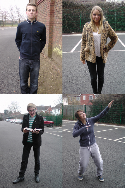
Below is an image of our characters in their costumes.

PLANNING - Production Plan

Who:
Charlotte Randall, Mollie Hinson & Emma Shepherd - Production team.
Joe Davis - Tom
Jack Hurst - Jack
Dani Richardson - Sarah
Phoebe Nickalls - Emily

Dates:
January 7th
January 21st
February 3rd
February 10th

Equipment:
Tripod
Camera
Camera charger

Costumes:
Joe Davis (Tom) - Wearing casual jeans and a jacket, with trainers.
Jack Hurst (Jack) - Wearing jeans, and a checked shirt. Also wearing glasses, looking smart.
Dani Richardson (Sarah) - Hoodie, tracksuit bottoms and trainers. Tom-boyish.
Phoebe Nickalls (Emily) - Black jeans and a white jumper. Also wearing Dolly shoes, carrying a handbag and wearing jewrelly.

Locations and why you have chosen them:


Risk assesment:


Playground:


  • Risks - Falling off of the bike onto the concrete. 
  • Precautions - Make sure the person riding the bike is confident and capable, wear helmets, knee and elbow pads (under clothing)
Classroom:


  • Risks - Tripping over chairs / wires / bags etc.
  • Precautions - Make sure all chairs are tucked in, make sure wires are clamped to walls etc and bags are safely out of the way.
School Field:


  • Risks - Slipping over on wet grass, and injuring herself with the ball.
  • Precautions - Make sure we film on a dry day and ensure the actor is confident with the skills they need to demonstrate. Do not mess around with the props.
Corridor:


  • Risks - Bumping into other students and getting stuck in the locker.
  • Precaution - Film during lesson time to ensure there are no students wandering around the school. Make sure that the locker is big enough and safe enough for the actor to get in and out of. Do not mess around with the props.


    Props:
    Bike
    Helmet
    Elbow and knee pads
    Compact mirror
    Handbag
    Lipstick
    Text books
    Glasses
    Ball
    Locker
    Mobile phone

    Tuesday, 6 December 2011

    RESEARCH - Focus Group

    From analyzing my questionnaire results i found out that the majority of people that completed it were up to the ages of five, although i am going to make this a little older because i feel they are too young to realize what they like and dislike about things, so I've decided to use the age range of 4 to 9. I used six children in this age range, 3 boys and 3 girls to make it fair.I showed them all the three opening sequences I had previously analysed, these were: Lizzie McGuire, Balamory and Ben 10.  I then asked them what they liked and disliked about these opening sequences.

    Lizzie McGuire

    • Only 16.% noticed the directors and producers names which were show at the beginning of the sequence. 
    • 66.%  said they like the plain white background as it made the characters stand out, although 40%  thought that it was boring. 
    • 84% said they like the fact the characters names appeared at the side of them, clearly showing who was who helping you follow it if your new to the programme. 
    • 80% said that they like the "big ball" prob because it showed the excitement and closeness of the family. 
    Balamory
    • 80% said that they liked the music created just for Balamory as it is fun and explanatory.
    • 20% thought the song was too repetitive. 
    • 36% said they liked the use of CGI and bright colouring used in the opening sequence.
    • 50% said that they liked the way you followed the characters showing what they do and getting an idea of their personality.  
    • 64% said they didn't like the idea of CGI as it was too childish. 
    Ben 10
    • 80% of people said they like the idea of having a prop like "Bens watch" will can allow them too change into another character instantly. 
    • 50% said they like the idea of the aliens being shown which Ben can turn into. 
    • 50% disliked this because they thought it gave away too much of the progamme.
    • 36% said they like the space effect at the beginning.
    • 100% though a minute was just the right length for an opening sequence. 
    After finding out these results, i told my focus group of the idea i have for my opening sequence. I asked them too come up with at least two things they liked and disliked about my ideas. The majority of peoples answers were..

    What they like most. 
    The things that i mentioned that appealed to them most were...
    • Having an opening sequence that was between 40 seconds and a minute long.
    • Introducing all main characters one by one, ensuring you know their personalities.
    • They liked the idea of a upbeat, young track.
    What they disliked..
    The things that they disliked most were..
    • Having computer generated characters - they said this was childish. 
    • The colour scheme of red blue and green, they said they only like the idea of blue and red. 
    I will take this research into consideration when creating my opening sequence.

    RESEARCH - Audience Research Analysis - Dvd and Magazine.

    I also created a questionnaire to find out what people preferred on their DVD and Magazine covers. I found out that the majority of people did not want the directors/producers names on the front of the DVD cover. I also found out that most people completing my questionnaire wanted three main characters on the front of the DVD/Magazine covers and the most popular colours people wanted were blue and red. This will be suitable because they both can be used as unisex colours so i can appeal to a larger audience. Furthermore i found out that people want the same colours used on the DVD cover to be used in the Magazine. Also, the most popular things people wanted included in the magazine were Character fact files, quizzes and stories. Lastly i found out that people completing my questionnaire want the same characters to be on the DVD and Magazine covers.


    These print screens show that the majority of people do not want the producers or directors names on the front covers, also that people want three characters on the front covers and want them to all be main characters. 


    This shows that most people prefer the colours of blue and red, this will be suitable because these can be used as unisex colours. 


    These print screens show that the majority of people want the same colours used for both the DVD and Magazine covers. Also the preferred things to be included in the magazine are quizzes, stories and Character fact files. 

    Lastly, i found out that most people want the same characters to be used in both the DVD and Magazine.