I used social neworking sities such as
Facebook to share my work as a way to gain audience feedback. This is an effective way to collect information as people are free to comment on my work and are open to their own veiw, as there is no closed questions. I asked people to comment on my work, telling me what was good, bad and what could be improved. Below is the feedback i recieved.
Back of DVD cover
Front of DVD cover
Magazine cover
The feedback i have received on the back of my DVD cover was as follows;
-Maybe add the characters names underneath to make it that little more effective
-
The DVD write up makes the DVD sound fun to watch. Brand identity has been used here.
The feedback i have received on the front of my DVD cover was as follows;
- Hey, I don't really talk to you, but I had this issue with my coursework, the photos rather entertaining, but it doesn't really say what the DVD is about, some kind of running for sport? Other than that its quite good, maybe add like a subtitle/ catch phrase to imply what it is. Hope Ive helped :)
- nice use of colours and good picture, just the DVD picture thing is slightly cut off on the right
-
I agree with above comments, maybe add in a catch phrase to give an idea what the DVD is about
- DVD cover looks good and the different & fun colours have been used again (Brand identity)
The feedback i have received on my magazine cover is as follows;
- Very good, clear writing, large image, lots of tag lines, most of space covered, but not too cluttered, good work!
- It will entice the young children which it is aimed for, its got a good use of different colours which will attract their attention, it also has a free sticker book which is soooo cool. The name of the magazine is on all the 3 pages which represents brand identity. I also like the way you can collect all 4 posters, it will make people buy all the magazines
- Fantastic, this is the best one.
Through posting both on facebook my progress, I found out what people liked and disliked about my product. I found that consumers wanted to see a catch phrase on the DVD cover to give an idea what the programme was about, so i added in , "meet Tom, Jack, Sarah & Emily on their journey through high school." I also found out from my research that on the back of my DVD cover consumers wanted to see names above each picture of the individual character, so i added this feature to ensure my product was the best it could be. Furthermore i found out that my magazine cover was the best one i had produced and i found out that the audience liked that product mostly, so i left it the way it was as i felt it was successful enough. Overall, from the audience feedback i received through Facebook, i was able to change my products in the best possible way, making them more attractive to the target audience. I feel that by doing this i have made the best i could of out of my products.
_____________________________________________________________________________
Below is my survey i produced to receive feedback on my audiovisual media product.
Create your
free online surveys with SurveyMonkey, the world's leading questionnaire tool.
Here are my responses;
The first response shows that i had feedback from both males and females, showing a wider range of responses. My second question shows that the audience taking my survey were between the ages of 6-10, meaning that they are in the age range for my particular target audience, so their feedback will be the most important for my product, as they are who I'm aiming it at.
My third question shows that both participants thought that my opening sequence appealed to them.
One of the strengths recognised by my audience was that they liked the way each character was introduced individually, this feedback is effective for me because if i was too make another product i will know whats effective.
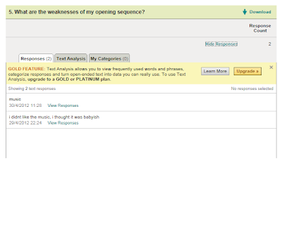
From asking what people thought were the weaknesses of my opening sequence was and how i could improve it; i found that my audience didn't enjoy the music i had chosen for my programme, this was effective for me because it gave me a chance to change it to something more appropriate.
_______________________________________________________________________________
Create your
free online surveys with SurveyMonkey, the world's leading questionnaire tool.
I also created a survey to gain feedback for my ancillary tasks, below were the responses i received.
100% thought that i used a variety of fonts excellently and that my images were effective.
100% of people thought that the colors i used were unisex and attracted a wide audience, this is important as i aimed my product at both males and females. When asking if my layout was suitable, i had positive responses.
100% thought that most of my language was appropriate for my target audience, and the main things people liked about my magazine was the colors.
I had mostly positive feedback when asking what people liked and disliked about my DVD cover. Someone suggested that i should add a tag line explaining what the DVD was about, so i did.
Feedback suggested that i should add more cover lines onto my magazine cover.
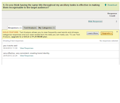
100% thought that having the same title throughout all my products was effective as it was consistent and created brand identity.
100% of people completing my questionnaire said that they would buy my magazine or DVD cover.
By completing these surveys i have gained constructive feedback on the products i have produced. I have learnt from my audience what aspects they liked most, what they disliked and what they thought could be improved. Overall, i received positive feedback with a few changes.
_______________________________________________________________________________
I also used a focus group to gain feedback and help me with my evaluation. I asked two children, Bridie aged 6 and Bobby aged 10 a variety of questions after showing them my video for my opening sequence. The questions i asked my focus group were:
1: What did you like best about the video?
2: What did you dislike about the video?
3: What could i improve on in the video?
4: What did you think about the music in the video?
5: Did you like the variety of colours used?
6: Would they watch my programme? And why?
Bobby's response:
1: I liked the different characters
2: I didn't like Tom because i was unsure of his character
3: I would change the way Tom was shown
4: Yeah i enjoyed the music, it was cool
5: Yeah, they were really bright!
6: Yeah i would watch it because it looks interesting
Bridie's response:
1: I liked the character Emily because she was a girl and like how i want to be!!
2: I didn't like the character Tom because he didn't look fun
3: I would make Tom more fun
4: I like the music, it was fun
5: Yeah they were bright and fun
6: I would watch it because i like the characters
By having a focus group i was able to gain first hand knowledge on what my target audience liked and disliked about my opening sequence. By having this knowledge i now know what to keep the same and what to improve on if i was going to do it again. I learnt that both respondents liked the use of different characters, but thought Tom's character was unclear. I also learnt that both respondents like the music and colours and thought it was bright, which is what i aimed to do. Both respondents said they would watch my product which is a positive outcome.
_________________________________________________________________________________


